-
2023/08/24/用户新增预测挑战赛-数据分析与可视化/
任务2.1 数据分析与可视化
# 导入库
import pandas as pd
import numpy as np
import matplotlib.pyplot as plt
import seaborn as sns

# 读取训练集和测试集文件
train_data = pd.read_csv('用户新增预测挑战赛公开数据/train.csv')
test_data = pd.read_csv('用户新增预测挑战赛公开数据/test.csv')

# 相关性热力图
sns.heatmap(train_data.corr().abs(), cmap='YlOrRd')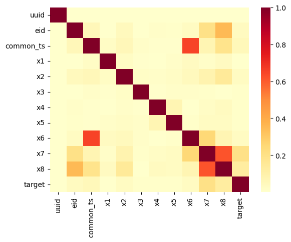
通过分析相关性并画热力图,可以看出common_ts与x6, x7与x8具有显著相关性。
# x7分组下标签均值
sns.barplot(x='x7', y='target', data=train_data)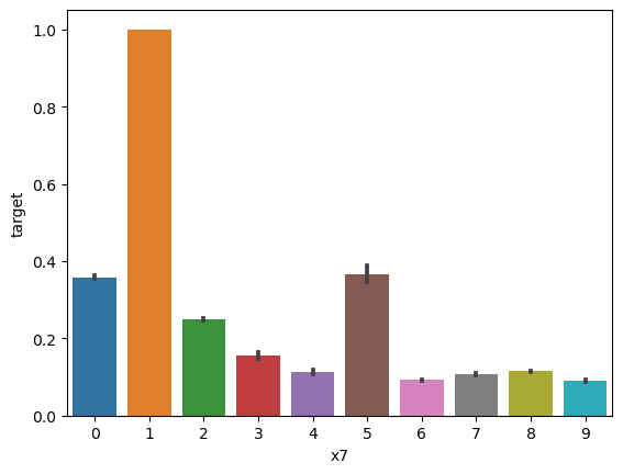
x7取值是离散的,说明是类别属性。
- 字段x1至x8为用户相关的属性,为匿名处理字段。添加代码对这些数据字段的取值分析,那些字段为数值类型?那些字段为类别类型?
fig, axes = plt.subplots(nrows=2, ncols=2, figsize=(12, 6))
coordinates = [[0, 0], [0, 1], [1, 0], [1, 1]]
types = [1,2,6,8]

# x7分组下标签均值
for i in types:
    ax = axes[coordinates[types.index(i)][0],coordinates[types.index(i)][1]]  # Get the current Axes object

    sns.barplot(x=f'x{i}', y='target', data=train_data, ax=ax)  # Plot on the current Axes

    ax.set_title(f'x{i} vs Target')  # Set subplot title
    ax.set_xlabel(f'x{i}')  # Set x-axis label
    ax.set_ylabel('Target')  # Set y-axis label

# Adjust layout
plt.tight_layout()

# Show the plots
plt.show()
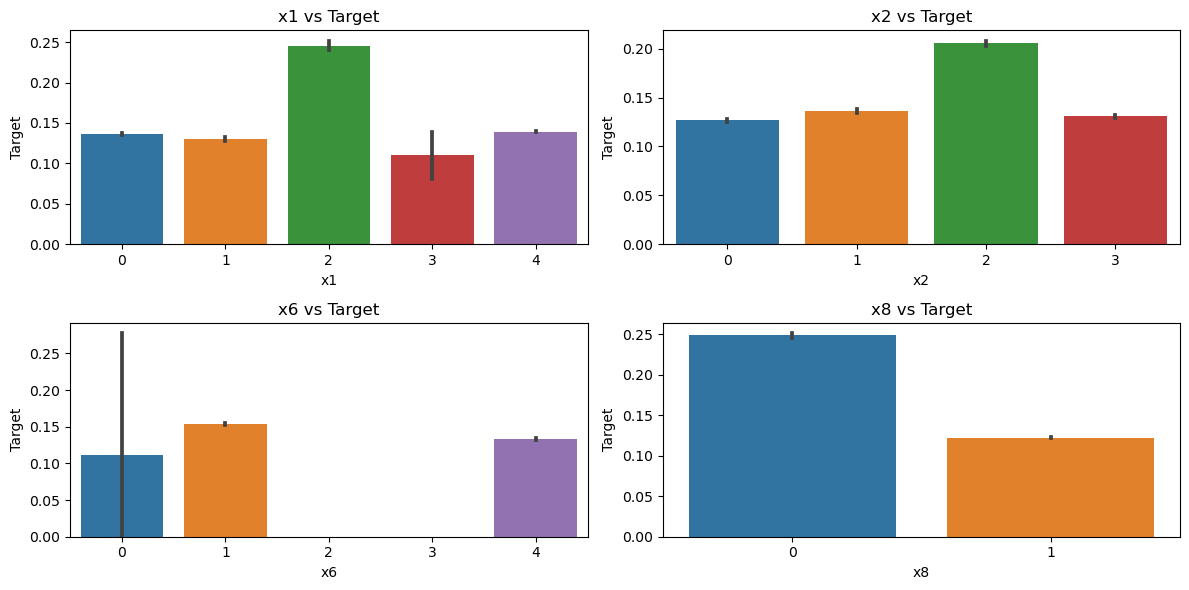
这说明x1,x2,x6,x8均为类别属性。
fig, axes = plt.subplots(nrows=3, ncols=1, figsize=(12, 6))
types = [3,4,5]

# x7分组下标签均值
for i in types:
    ax = axes[types.index(i)]  # Get the current Axes object

    sns.barplot(x=f'x{i}', y='target', data=train_data, ax=ax)  # Plot on the current Axes

    ax.set_title(f'x{i} vs Target')  # Set subplot title
    ax.set_xlabel(f'x{i}')  # Set x-axis label
    ax.set_ylabel('Target')  # Set y-axis label

# Adjust layout
plt.tight_layout()

# Show the plots
plt.show()
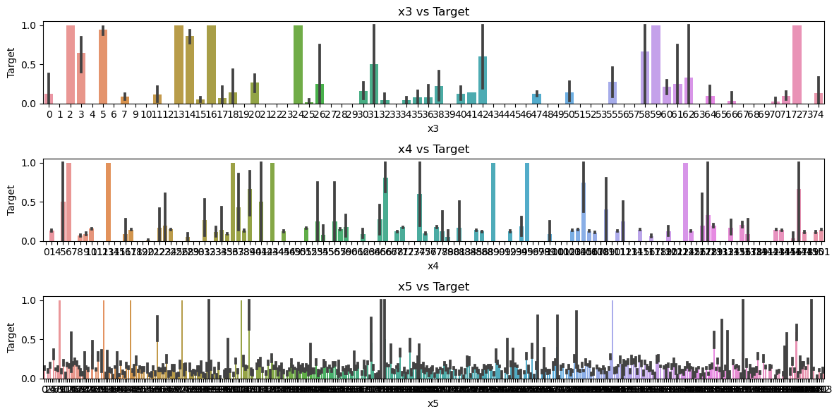
这说明x3,x4,x5都是数值属性。
- 对于数值类型的字段,考虑绘制在标签分组下的箱线图。
fig, axes = plt.subplots(nrows=1, ncols=3, figsize=(12, 6))
types = [3,4,5]

# x7分组下标签均值
for i in types:
    ax = axes[types.index(i)]  # Get the current Axes object

    df = train_data[['target', f'x{i}']].groupby('target')
    df.boxplot(column=f'x{i}', subplots=False, ax=ax) # Plot on the current Axes

# Adjust layout
plt.tight_layout()

# Show the plots
plt.show()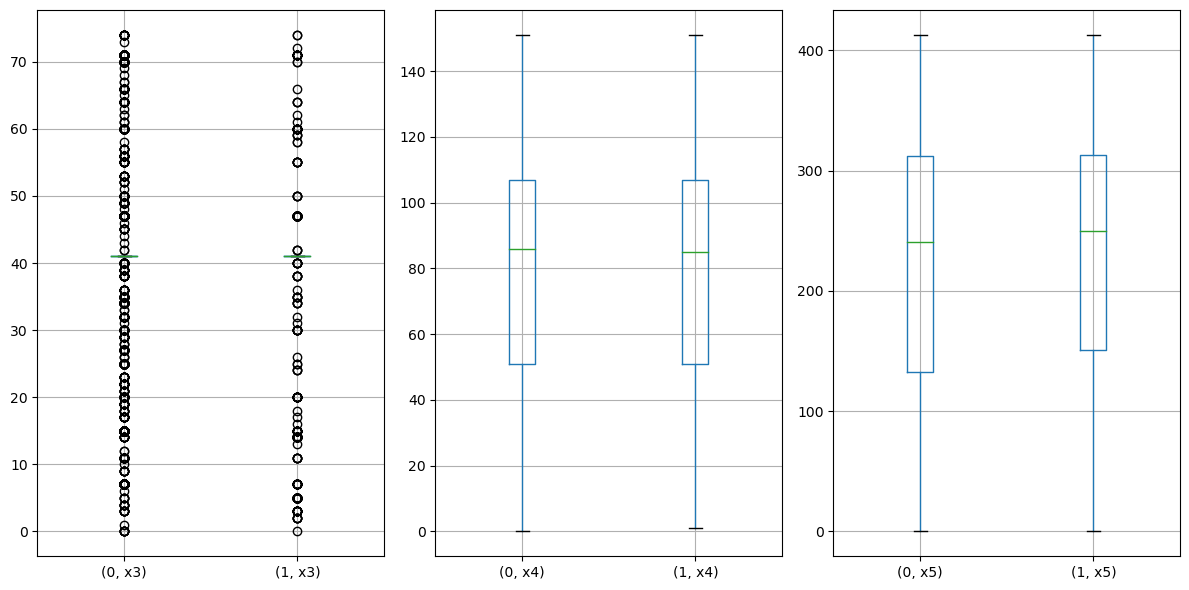
注意到x4, x5的分布较为均匀正常,而x3有很多异常值,不适用箱线图。
df = train_data[['target', 'x3']].groupby('target')
for target_value, group_df in df:
    # target_value is the value of the 'target' column for the group
    # group_df is the DataFrame containing the data for that group
    print(f"Target: {target_value}")
    print(group_df)
Target: 0
target x3
0 0 41
1 0 41
2 0 41
3 0 41
4 0 41
... ... ..
620350 0 41
620351 0 41
620352 0 41
620354 0 41
620355 0 41
[533155 rows x 2 columns]
Target: 1
target x3
5 1 41
9 1 41
10 1 41
36 1 41
43 1 41
... ... ..
620326 1 41
620343 1 41
620346 1 41
620349 1 41
620353 1 41
[87201 rows x 2 columns]
# Assuming df is the grouped DataFrame as you mentioned: df = train_data[['target', 'x3']].groupby('target')
# Calculate the value counts for the 'x3' column in each group
value_counts_0 = df.get_group(0)['x3'].value_counts()
value_counts_1 = df.get_group(1)['x3'].value_counts()

# Plot the frequency distribution for each target group
plt.figure(figsize=(10, 5))

plt.subplot(1, 2, 1)  # Subplot for target 0
plt.bar(value_counts_0.index, value_counts_0.values)
plt.title("Frequency Distribution of x3 (Target 0)")
plt.xlabel("x3")
plt.ylabel("Frequency")

plt.subplot(1, 2, 2)  # Subplot for target 1
plt.bar(value_counts_1.index, value_counts_1.values)
plt.title("Frequency Distribution of x3 (Target 1)")
plt.xlabel("x3")
plt.ylabel("Frequency")

plt.tight_layout()
plt.show()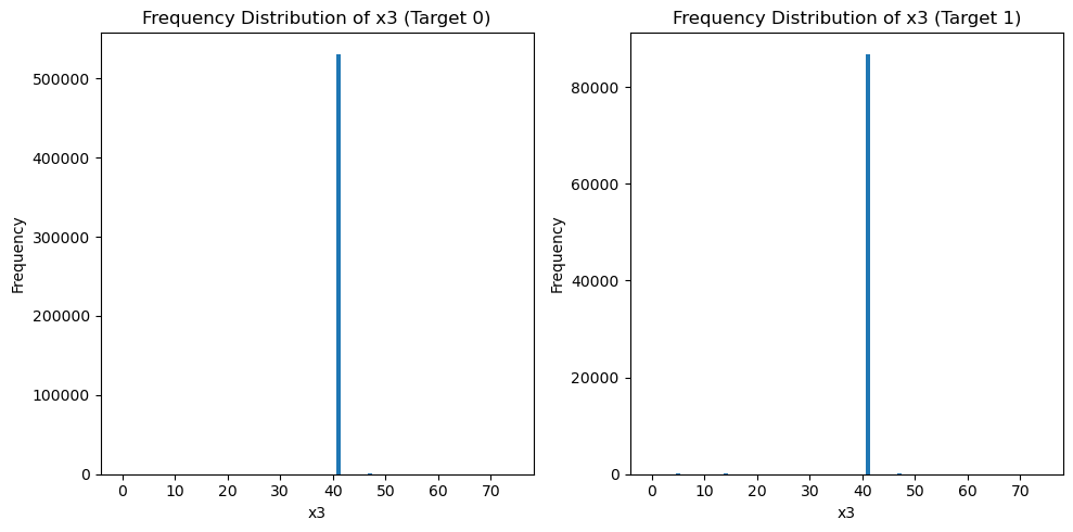
print(value_counts_0)
print(value_counts_1)
41 531017
47 478
15 265
7 238
71 133
...
69 1
58 1
6 1
63 1
65 1
Name: x3, Length: 66, dtype: int64
41 86836
47 67
5 63
14 57
7 22
60 17
20 16
15 14
71 14
3 13
30 8
40 7
55 6
11 5
35 5
2 5
38 5
50 4
34 4
42 3
59 3
24 3
64 3
58 2
70 2
74 2
25 2
17 1
0 1
36 1
16 1
62 1
72 1
66 1
31 1
26 1
32 1
61 1
18 1
13 1
Name: x3, dtype: int64
这说明x3主要集中在取值41.
- 从common_ts中提取小时,绘制每小时下标签分布的变化。
train_data['common_ts'] = pd.to_datetime(train_data['common_ts'], unit='ms')
train_data['common_ts_hour'] = train_data['common_ts'].dt.hoursns.barplot(x='common_ts_hour', y='target', data=train_data)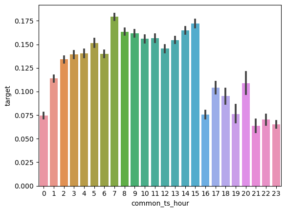
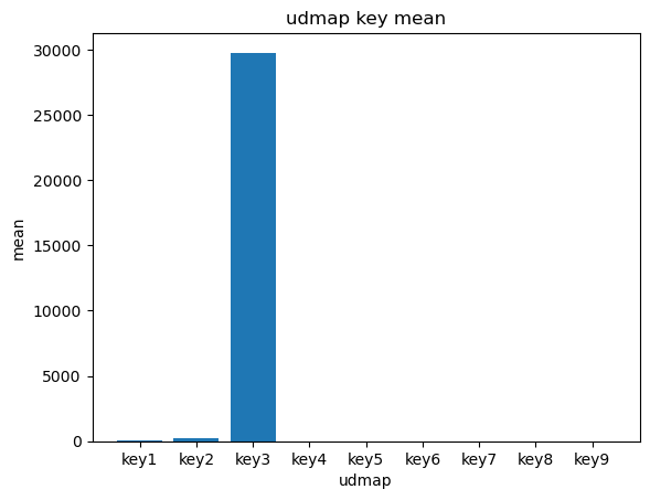
- 对udmap进行onehot,统计每个key对应的标签均值,绘制直方图。
def udmap_onethot(d):
    v = np.zeros(9)  # 创建一个长度为 9 的零数组
    if d == 'unknown':  # 如果 'udmap' 的值是 'unknown'
        return v  # 返回零数组
    d = eval(d)  # 将 'udmap' 的值解析为一个字典
    for i in range(1, 10):  # 遍历 'key1' 到 'key9', 注意, 这里不包括10本身
        if 'key' + str(i) in d:  # 如果当前键存在于字典中
            v[i-1] = d['key' + str(i)]  # 将字典中的值存储在对应的索引位置上

    return v  # 返回 One-Hot 编码后的数组

# 使用 apply() 方法将 udmap_onethot 函数应用于每个样本的 'udmap' 列
# np.vstack() 用于将结果堆叠成一个数组
train_udmap_df = pd.DataFrame(np.vstack(train_data['udmap'].apply(udmap_onethot)))

# 为新的特征 DataFrame 命名列名
train_udmap_df.columns = ['key' + str(i) for i in range(1, 10)]

# 将编码后的 udmap 特征与原始数据进行拼接,沿着列方向拼接
train_data = pd.concat([train_data, train_udmap_df], axis=1)

# 4. 编码 udmap 是否为空
# 使用比较运算符将每个样本的 'udmap' 列与字符串 'unknown' 进行比较,返回一个布尔值的 Series
# 使用 astype(int) 将布尔值转换为整数(0 或 1),以便进行后续的数值计算和分析
train_data['udmap_isunknown'] = (train_data['udmap'] == 'unknown').astype(int)
test_data['udmap_isunknown'] = (test_data['udmap'] == 'unknown').astype(int)
udmap_key = []
for i in range(1, 10):
udmap_key.append(train_data[f'key{i}'].mean())
udmap_key[64.21648698489254,
260.31666333524623,
29757.776829755818,
1.4501092920839003,
1.301670331229165,
6.83070527245646,
0.0005883718381058618,
0.0001402420545622191,
0.005659653489286797]
keylabel = ['key' + str(i) for  i in range(1, 10) ]
plt.bar(keylabel, udmap_key)
plt.title("udmap key mean")
plt.xlabel("udmap")
plt.ylabel("mean")
Text(0, 0.5, 'mean')
Author: Siyuan
URL: https://siyuan-zou.github.io/2023/08/24/%E7%94%A8%E6%88%B7%E6%96%B0%E5%A2%9E%E9%A2%84%E6%B5%8B%E6%8C%91%E6%88%98%E8%B5%9B-%E6%95%B0%E6%8D%AE%E5%88%86%E6%9E%90%E4%B8%8E%E5%8F%AF%E8%A7%86%E5%8C%96/
This work is licensed under a CC BY-SA 4.0 .